Columns
Previous chapters explained how to determine the size and position of one element. Usually, though, you want to do both at the same time, for multiple elements.
Consider a grid of tiles. Many websites, especially on the homepage, feature such a grid. It might even be a dynamic one, with tiles having different sizes, some with an image and some without.
How would you do that? You certainly don’t want to move around every element individually. It might even be impossible.
Instead, CSS provides several different approaches for the general skeleton or template of your layout. Some simple properties to set on a container, which automatically turns what’s inside into a usable format (such as a grid).
This chapter starts with the first and the easiest: columns.
To turn the content of any CSS box into columns, use the columns property.
Columns
When I say columns, most people will immediately think of text. But these are webpages we’re talking about. The content of a box can be anything—any collection of boxes with any styling.
As such, many fancy website layouts … are secretly just multicolumn containers behind the scenes!
Because what do columns actually do? They say …
- Divide the content of this box …
- Into multiple horizontal sections which are roughly equally tall.
They distribute the content in a fair and spread-out way.

This explanation also reveals the two values you can set.
- A length indicating the width of every column.
- Or a number indicating how many columns you want.
You can also set both, with a space between them. If you want the browser to fit the columns on their own, without your input, use the auto value (for “automatic”) instead.
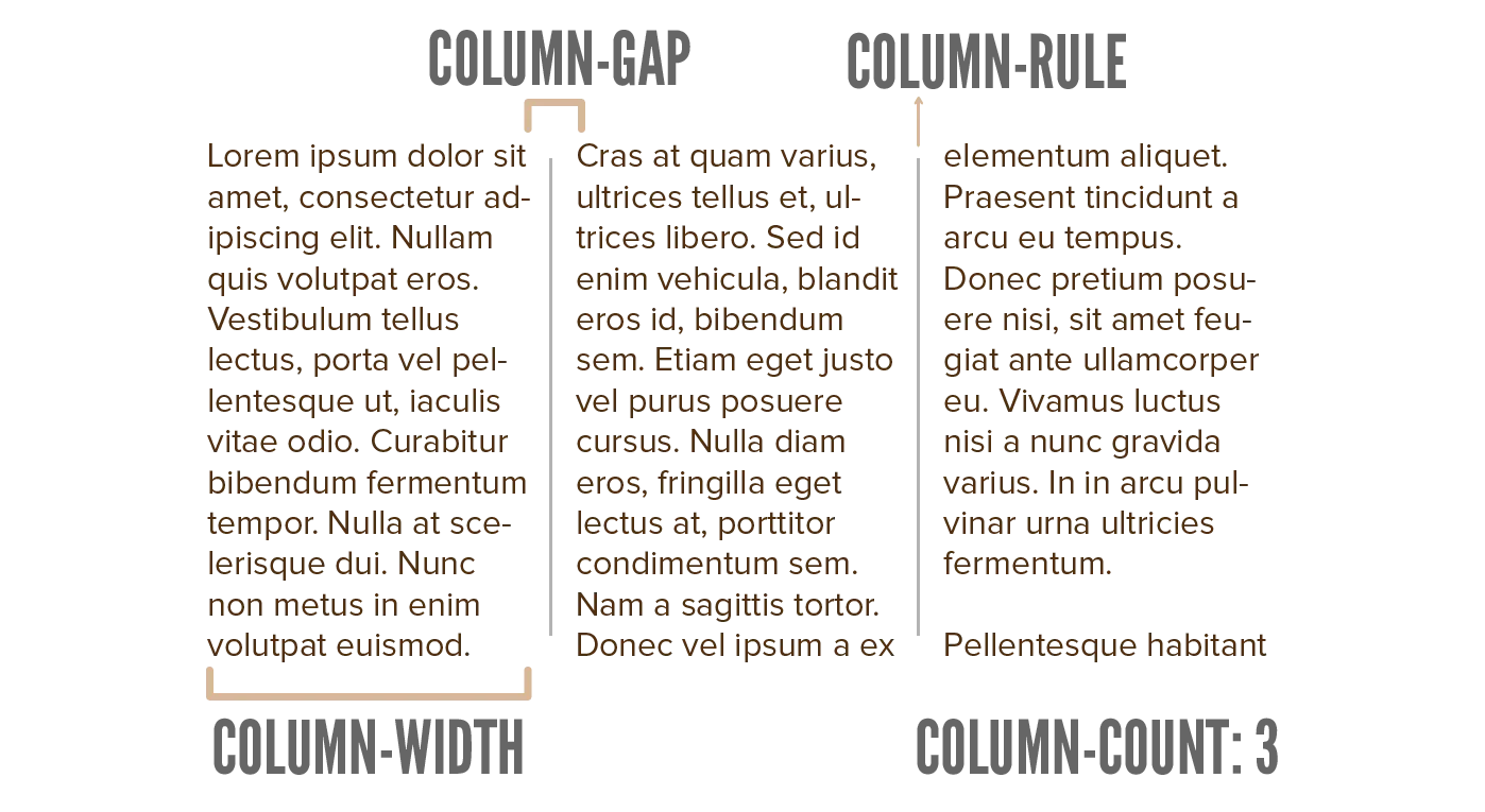
As you see, the image nicely follows along. Now imagine replacing this text with big tiles or pretty images, and you can see how this simple change can create a very nice, dynamic layout for an entire page.
Column Properties
As shown in the image, there are several other properties that can change the column layout.
column-count: set the number of columns directlycolumn-width: set the column width directlycolumn-gap: how much empty space there should be between columns (horizontally)column-rule: a thin border to display between the columns. (This follows the same values as theborder. Don’t worry about this now, I will explain it at the Border chapter.)
Want to support me?
Buy one of my projects. You get something nice, I get something nice.
Donate through a popular platform using the link below.
Simply giving feedback or spreading the word is also worth a lot.