Border
When I explained the box model—quite some chapters ago by now—one of the four properties was the border. By default, this is invisible, which allowed me to ignore it until now.
Why? Because it’s really powerful, but also requires a bit more explanation of new ideas.
A simple border
The border of a CSS element has three properties.
- Thickness
- Style
- Color
If you don’t set all three, the border will not show up.
This is a common frustration for beginners: they set a border color, but it doesn’t show up! Why? Because they haven’t also given a thickness and type to the border!
As usual, you can set all three at once with the border property. But in this course, we’ll always start by being explicit and setting them one by one.
border-thickness: a number (with unit!)border-style: a style from a list of named values. (The default, which you need 99% of the time, issolid.)border-color: any color.
This is a reminder that this course is not a documentation. If you want to know all the values that border-style can take, visit the MDN Docs. This course is a practical beginner guide that efficiently leads you into the world of CSS.
A rounded border
One easy way to make the designs less … “boxy” is by making the corners of the border rounded.
Use the border-radius property for this, which receives a number.
A value of 50%—half the font size—is maximum roundness. If you set the border-radius to that, the box … simply becomes a circle!
Outline
One border is nice. But what if you could have … two borders?
The outline is a border drawn outside the element (so also outside the border). It’s ignored when calculating the element’s dimensions, which means it might overlap the elements around it.
There are some advantages to this property.
- The border can be moved further away from the content.
- You can add a double border, perhaps because the original border is displayed as an image (see the section below).
- This border does not affect dimensions.
It has the same components as border (thickness, style, color).
But it adds one extra property: outline-offset. It’s a number that determines how far away the outline is from the original border.
Border Image
The real power of borders is that you can use an image instead. For this, use the border-image property.
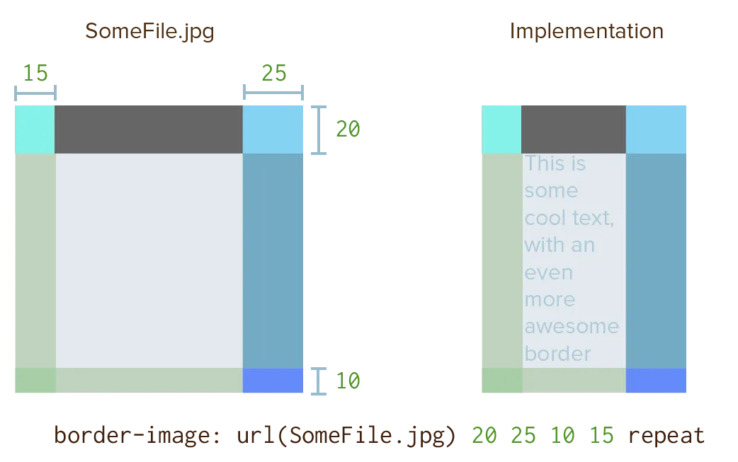
Anybody who has ever created user interfaces or video games will recognize this as a “nine slice rectangle”.
- You provide an image, preferably square
- Then you define how to slice it into nine parts. (Two horizontal cuts, two vertical cuts.)
- The center part can be used to fill the background of the element or just ignored.
- The other 8 parts are now used to fill in the borders of the element.
Below is a (very simplified) example of what that looks like.

These are all the individual properties.
border-image-source: URL to the base imageborder-image-slice: the four locations to slice the image. (If you addfillto the end, it uses the center slice to fill the background of the element. By default, it doesn’t.)border-image-width: the thickness of the borderborder-image-outset: how far to move the border away from its original positionborder-image-repeat: how to repeat slices to fill all the available space
There are, however, many options. How to cut, how to repeat the border sections, whether to fill it in or not, etcetera.
Giving all the options would just overwhelm you and achieve nothing. (Also, as said before, this is not a documentation!)
Instead, I’ve always used a simple visual tool to generate my border-image settings for all my website. I like this one: Border Image Generator (MDN).
Below is an example from a fantastical border image I use on my Saga of Life website. Try changing the dimensions of the div and see how the border still fits like a glove. Also try changing the other properties, especially outset, and see what happens.
Click here to download the original image used for the borders in the example above. The best border comes from really simple base images.
Notice how I still have to set a border-style, even when I use an image. That remains the same: if not set, no border will display.
Remember from the Gradients chapter that gradients are considered images as well. So you can supply a gradient to the border-image if you want!
Want to support me?
Buy one of my projects. You get something nice, I get something nice.
Donate through a popular platform using the link below.
Simply giving feedback or spreading the word is also worth a lot.