Flexbox
Flexbox is the next concept to learn that decides both where to place multiple elements and their size at the same time. Once understood, you will use it anywhere. It can transform the entire layout of your website with just a few lines of code.
The name says it all. It turns a rigid CSS box into a flexible box. One that rearranges and grows/shrinks its contents in smart and configurable ways.
To turn any container into a “flexbox”, use display: flex.
There’s that display property again! The very important one that I explained at The Box Model
From now on, all its direct children are “flex items” and behave in a different way.
Gap
By default, all these flex items will be pushed against each other. To add whitespace—a gap—between them, use the gap property. It accepts any number (with unit, of course).
In the example, try removing the gap or playing with the value.
Wrapping
What does flexbox do? First of all, it moves all its children on the same line. (No wrapping, no elements flowing vertically.)
Sometimes this is what you want. But you can turn this off with flex-wrap: wrap, essentially returning to a layout similar to the default page flow.

In the example below, notice how the flex items wrap underneath each other. Remove this property, and they are forced to sit next to each other on the same line.
Direction
Now we can start to make our flexbox do something special!
The flex-direction property can take four values: row, row-reverse, column and column-reverse. This determines how the flex items inside are laid out.

This is already really powerful. A vertical (“column”) layout is extremely hard to do (well) with just the default page flow.
In the example below, notice how items are laid out vertically (even though wrapping is not enabled!)
Justify
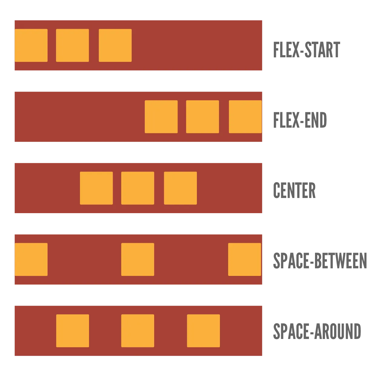
The justify property determines how to align items along the main direction (given by flex-direction).
So, if it’s a row, it determines how to align the items horizontally. If it’s column, it aligns the items vertically.
It can take these values, which are best explained with an image:
startendcenterspace-evenlyspace-betweenspace-around

In the example below, notice how the flex items are spread evenly across the main axis (horizontal). Also try playing with the justify-content property to see what happens.
Align Items
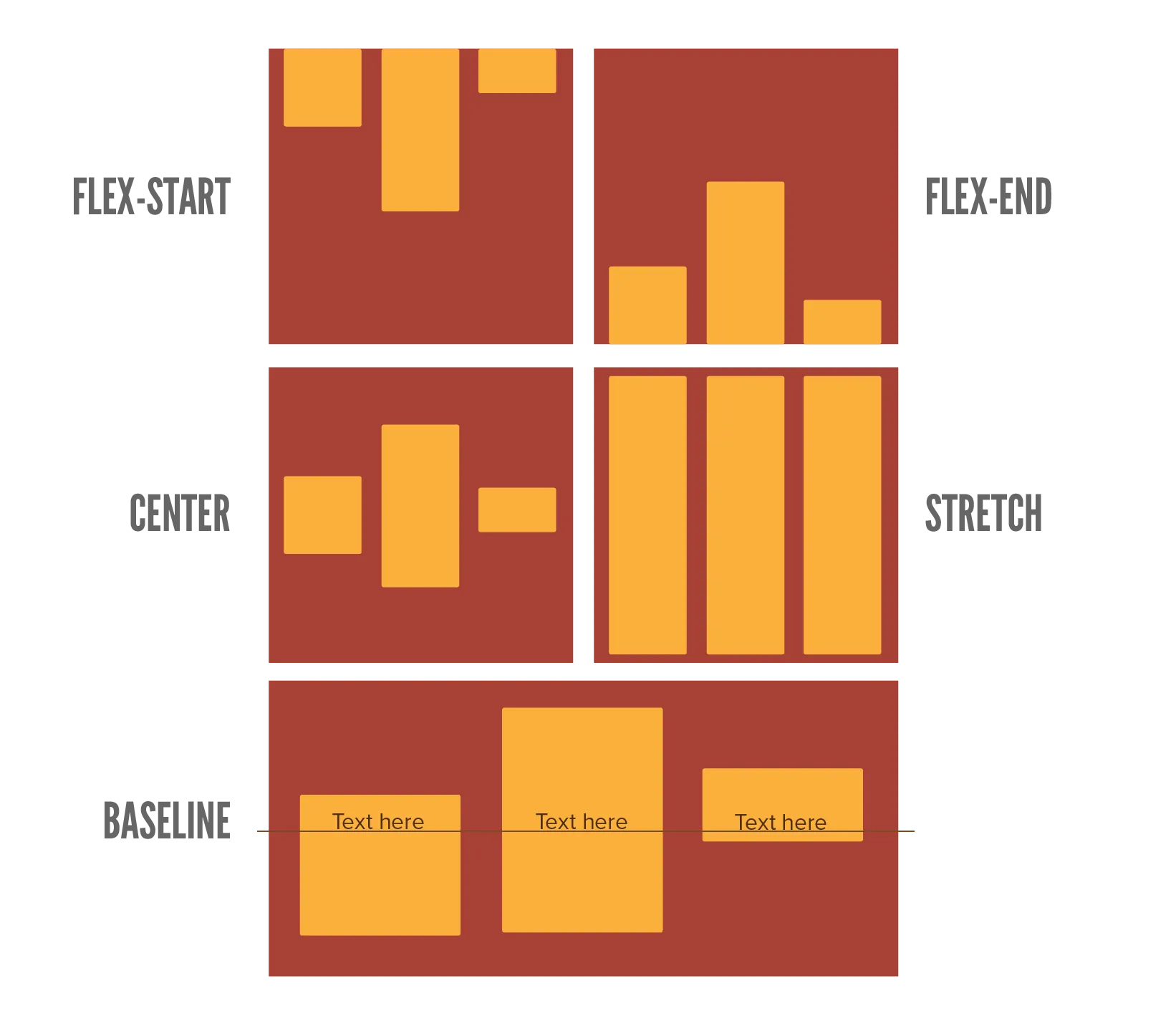
The align-items property aligns items across the other direction (perpendicular to flex-direction).
Say the flexbox direction is row. Whereas justify aligns the items horizontally, align-items would align them vertically.
It takes these values, again best explained with an image.
startendcenterstretchbaseline

In the example below, notice how the elements have different heights. But because align-items is set to center, the other elements don’t change their height, but instead everything positions around the same center line.
Align Content
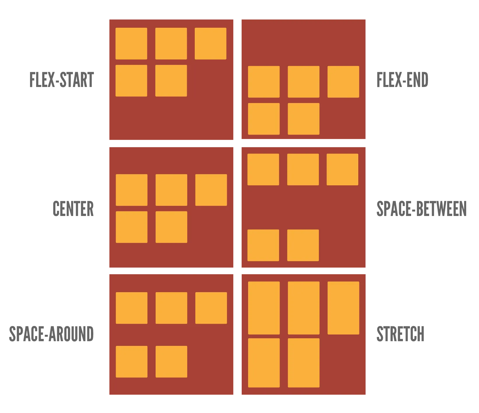
This only applies to flexboxes that wrap. Why? Because it’s about how to align the entire contents of the flexbox, instead of individual items. This only makes sense for a flexbox that wraps and, as such, has dynamic dimensions.
It takes the same values as the justify property.

In the example below, notice how the whole flexbox has moved to the end of its container. See what happens when you change align-content to something else.
Grow / Shrink
This is another powerful feature of the flexbox. Because the box resizes and wraps, there will often be “leftover space”. Empty space within the flexbox that isn’t filled.
With the flex-grow and flex-shrink properties, you can control how this space is filled. These take a number without unit, as it’s a ratio. The default value is 1: everything grows and shrinks equally.
For example, an element with flex-grow set to 0 will not grow. An element with value 2 will grow twice as fast as other elements. (And thus end up grabbing double the empty space that other elements grab.)
Beware! These properties are set on the flex item, not the flexbox container.

Pay careful attention to this example. The .wide element (the third) grows twice as large as the others. Which is expected, because it has flex-grow: 2.
But … why doesn’t the .narrow element (the first) shrink twice as quickly as the others?
Well, because shrinking only happens if there’s too little space. In this case, the default size of the elements is only 50px, which means there is too much space. So elements can only grow.
Change that value to something much bigger (like 300px), and now elements are too wide. The flexbox has to shrink them, so the flex-shrink property takes effect and you should see the narrow element actually shrink faster.
Basis
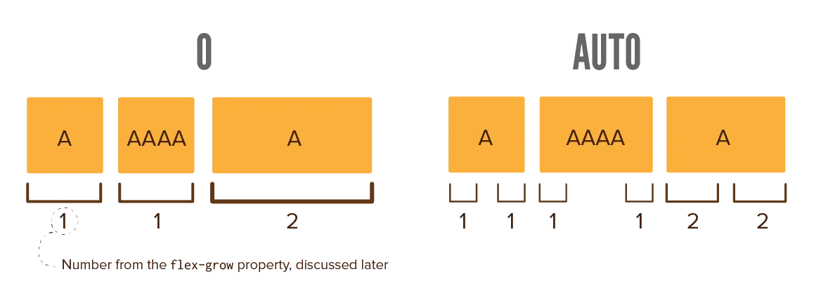
The flex-basis sets the initial size of a flex item along the main direction. (So width for rows and height for columns.)
It takes any number (including unit). By default, it’s auto (like most default values).
So … what’s the difference with just width or height? Visually, there isn’t really one, as most browsers should handle it just fine.
It is however cleaner and more correct to use this property instead. It leads to fewer bugs and makes sure your CSS clearly states its intention: “Hey, this should be the initial size of my item, but I know it will grow / shrink because it’s a flex item.”

That said, this is by far the least important property to know.
Conclusion
Flexboxes are really, really useful.
I come from a time before they were supported everywhere. It was a mess.
Whenever you wanted to align a set of items, you’d have to resort to loads of tricks, or putting them inside a fake table. If you wanted to resize elements nicely on the fly … forget about it.
With just a few properties, you can turn a container into a flexbox, and can make sure everything lines up perfectly and resizes to fill empty space. I use it all the time, both for big containers (the grid on a homepage), as well as tiny ones (perhaps a horizontal menu that I want nicely centered).
Speaking of grids … let’s quickly move to the next chapter!
Want to support me?
Buy one of my projects. You get something nice, I get something nice.
Donate through a popular platform using the link below.
Simply giving feedback or spreading the word is also worth a lot.